Starting At Square One
In this post, I would like to respond to my learning experiences in both Career education and our Diverse classrooms course. As a culmination of our learning in both courses, we were asked to create a capstone project. I believe that every single one of us in the cohort was a little anxious about attempting this assignment. This overarching feeling was mainly due to the fact that none of us had attempted a capstone before, but I think that encompasses connections to Career education well. I believe this because we were all afraid since we had no experience with the activity. As the semester grew with guidance and instruction we gained the needed skills to take on what was in front of us. Below I would like to share an image of the capstone I had created for these two courses.

To The Drawing Board!
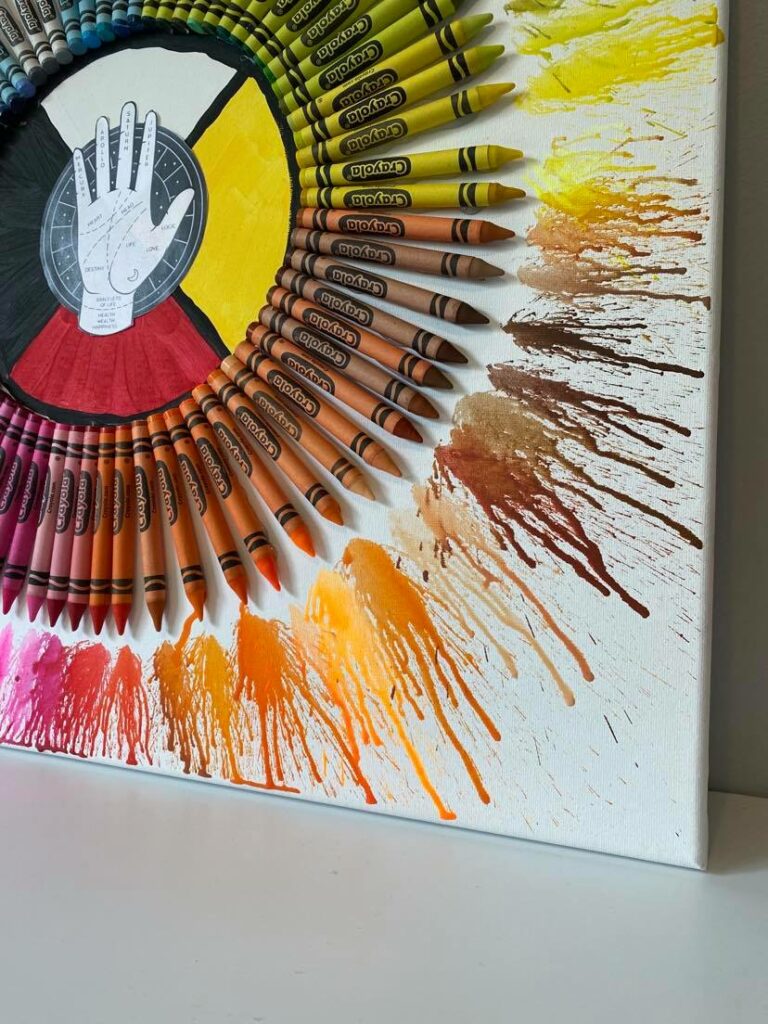
When I was creating this capstone I really wanted to find a way to represent all different types of learners to reference my experience in Educ 402: Diverse Classrooms. After pondering that thought for a while the idea of doing some melted rainbow crayon art came into my head. Yes, I will admit it is very “a la” Pinterest circa 2013 however, for me, this concept fit the bill. Why I chose this model as a base for my capstone was that all the different colours could represent all different learners, where they come from and their journeys. The rainbow, for me, represents all learners but can easily relate to the LGBTQ+ population. This rainbow of my own creation includes learners with diverse religious beliefs, languages, cultures, ethnicities, learning abilities and more. I also chose to include colours that are not typically in the rainbow such as pinks, greys, tans and browns. The brown and tan section in particular is important to me because it represents different groups coexisting. This concept really came alive for me because especially in the younger grades, you will hear students say “I need a skin colour” when doing artwork. I have witnessed a teacher approach this comment by asking the student if there is just one skin colour? and why applying a thing like skin colour to one type of person (usually caucasian/white) is problematic. These are conversations and ideas I look forward to interacting and sharing with my future students. included these colours because I wanted to emphasize that inclusion is going beyond the standard and reaching out beyond those boundaries, in this case beyond the standard ROYGBIV. The journey is what I think really connects these two courses, so the representation of where the individual will go following their experience with K-12 education is reflected in the splatters of the melted crayons. I feel this way because in our Career education course we talked a lot about how the self can affect your journey in your career/life but also the unexpected things through happenstance theory and the impact of others through the critical friend’s lens. I liked how the crayon splatters at first seem random to show the individual experimenting and figuring out their path and then slowly over time develop to some major leading lines to show how their paths become more stable and sustained over time depending on their experience. I also enjoyed that lots of the splatter patterns had multiple leading lines because for me it symbolized the changing world of work we are engaging with and that you may have more than one career in your lifetime or simultaneously.
Hitting the Core
I lastly just want to touch on the centre section of my capstone piece. I wanted to include the medicine wheel because not only does it lend itself to celebrating cultural diversity but it also directly connects to the “Circle of Courage” concept we covered in career education. The ideas of generosity, independence, belonging and mastery being so interconnected in this theory, I found I really identified my own experience in that circle of courage. I also like how the medicine wheel represents the balance between the four areas in which it carries (spiritual, emotional, physical and mental). I find that such balance is very hard to find in the society we are living in so for myself, having this at the centre of my capstone represents how integral that balance can be for a healthy life. The other portion of this middle section is the image of a palm with palmistry lines on it. I also wanted to include this because I found the idea of the lifeline to connecting really well with the rest of my capstone. I did not include this symbol because I know a lot about palmistry but rather because since my whole capstone was about the learner’s journey through life it made sense for me to have something like a lifeline that is so individualized at the centre.
Leave a Reply